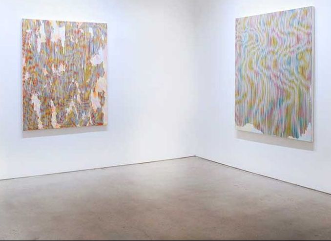
 Palinopsia, Joshua Liner Gallery, February 27 - March 29, 2014, New York 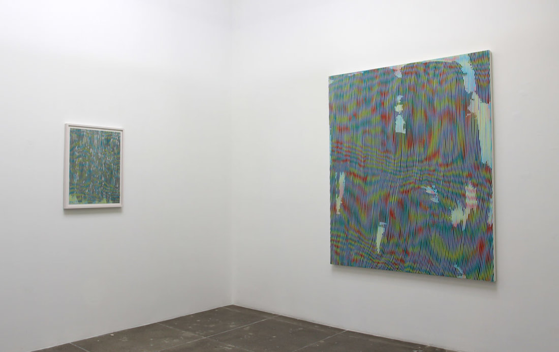 Project Room, Mark Moore Gallery, July 27 - September 7, 2013, Los Angeles I love how Oppermann's work takes a minute to completely understand. The intricate details within the painting come together to form a stunning large image through illusion. I would like to figure out a way to make my collages have very intricate details that create a larger image, something that makes viewers awestruck when they view the work close up. I also really appreciate her use of color. While in her work, she does utilize bright colors, she always manages to make the paintings look so calm and relaxed, somehow transforming the bold colors. Initially when I looked at the paintings I recognized them as very dull, pastel colored, but looking closer the bold colors are very evident, there is beauty in moderation. This reminds me of Chuck Close's work with color in the portraits he makes.
0 Comments
I visited the VMFA on October 13th and explored a section I had never really made it up to before, the South Asian Collection.
This week I was able to finish the project. I added the colored cello-wrap to the back of the board, gluing it so that it wasn't visible from the front, appearing like a window. I also got the piece ready to hang before the critique. The most difficult thing I dealt with regarding this project this past week was the cardboard edge of my piece. Due to the fact that it's corrugated cardboard, it is so difficult to cut a neat edge. I tried to make all of the edges black to see if that would help but the corrugation didn't allow for me to fill the edges a solid black.
Moving forward with the theme of identity, I am creating a piece utilizing the idea of memory and how individual memories play a role in building one's identity. I am using personal photographs to build a collage, incorporating more three dimensional elements than in my pieces before.
All of my pieces are gravitating towards the theme of personal identity. This piece in particular focuses on the transparency of image. You can create an appearance but that does not permeate beyond the surface, your true self can easily be exposed and that isn't a bad thing. I tried to mimic the effect of my collages with the use of different colors of paint and small brushstrokes with coordinating colors. This painting has gone even more nonobjective, I would like to experiment with more free interpretation for the viewer while emphasizing my own content.
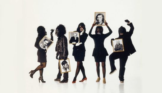
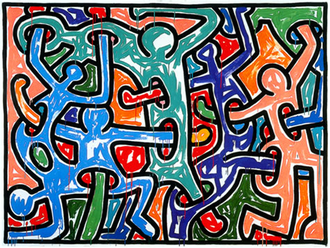
I love the childlike look of Keith's work. The style in which he messily fills the figures drawn with color makes the piece much more interesting. My work with collage made filling spaces in with color more interesting as well. While his style focuses more on mark making, mine so far has focused on using ranges of colors and layering. I would like to combine these two different approaches by creating paintings which mimic the effect of my collages, using exciting brush strokes of different variations of a color to fill spaces. I also love how the figures in this work are so connected and active. It's just an exciting painting to look at. When you look closely you can see that the arms change to red once they pass through another figure. I believe he's portraying his content, awareness of HIV/AIDs and the origin of the disease from human touch and connection. I would like to find ways to make subtle, yet effective statements in my work, as he does.
This week, I worked to plan and begin on my first project. I am going to be making a collage going along with the theme of circumstance/environment, as seen in my summer work. We had originally decided to keep the collage small, to be more manageable in the small amount of time we have to work on it. After I began sketching on the cardboard, I decided that I was going to make it a little bit larger. This may seem ambitious, but my plan is to utilize the time that I have, after school or during lunch, in addition to being productive during class. So far, I have finished cutting the cardboard base out. 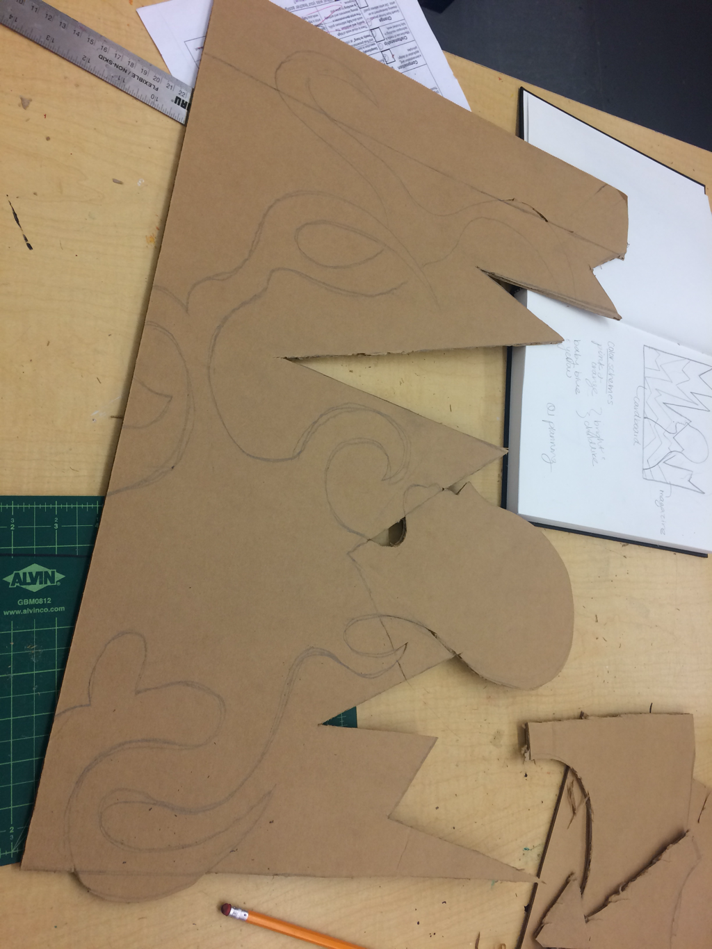 My final project will hang from the ceiling and the hand will be attached directly to the ceiling. I decided to stop at three layers of the yarn because I think that it looked the most aesthetically pleasing with those proportions to the hand and cup. Originally, I had wanted the hand to look realistic but I decided that I liked the plastic-y, falling-apart appearance and I feel as if that adds to the content.
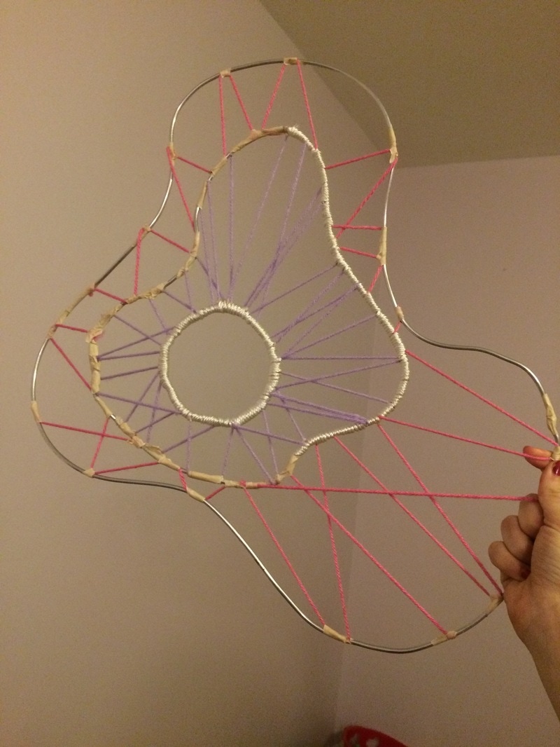 I have been working on making this part of the piece- not really sure what to call it. I have been using wire, masking tape, and string. I hope to add about three more layers.
|
|||||||||